A collection of relevant models established to help price bitcoin (some more serious than others) (7-10 min read)
Bitcoin is best understood as commodity money, like gold. It functions as a store of value first and unit of exchange second. Bitcoin is able to perform both functions extremely well through its first and second layer approach. The Bitcoin base-chain functions as the most robust store of value across space (remember, gold is a very bad store of value across space, as it is hard to move around) humanity has seen. Bitcoin arguably does not perform the store of value function as good as gold over time, as gold has existed for thousands of years. However, this creates a great risk/reward ratio for bitcoin upside potential, as bitcoin will continue to increase in value over time with its adoption. Before we dive into Bitcoin specific models, it is worthwhile to mention, that the 200 Day Moving Average works exceptionally well for bitcoins price movements. I noticed that Michael Saylor tends to buy bitcoin just when it bounces of the 200 Day Moving Average. The 200 Day Moving Average takes the prices of an asset for the past 200 days and divides it by 200, coming up with an “average price”. If an asset moves up in price quick and then comes back down, it usually touches the 200 Day Moving Average, before it moves back up.
The Lightning Network, Bitcoin’s second layer, performs the function of making bitcoin a great unit of exchange. As of now, Bitcoin does not perform the function of a unit of account, this will happen last, ones it has been adopted as a store of value and unit of exchange. The most referenced model to predicts bitcoins price, is the “Stock to Flow” Model. It is used to predict prices of scarce asset such as gold and silver, as scarcity can be quantified by Stock to Flow, which predicts an assets value by dividing its total stock by yearly production rate.
Stock to Flow Model (Live Chart): A method made popular by Plan B in 2019 which models bitcoins value by dividing its total stock by yearly production rate. The model is often used to predict prices of scarce asset such as gold and silver, as scarcity can be quantified by Stock to Flow. In 2020 Plan B extended the model modeling bitcoins price in relationship to gold & silver, introducing the Bitcoin Stock-to-Flow Cross Asset Model.
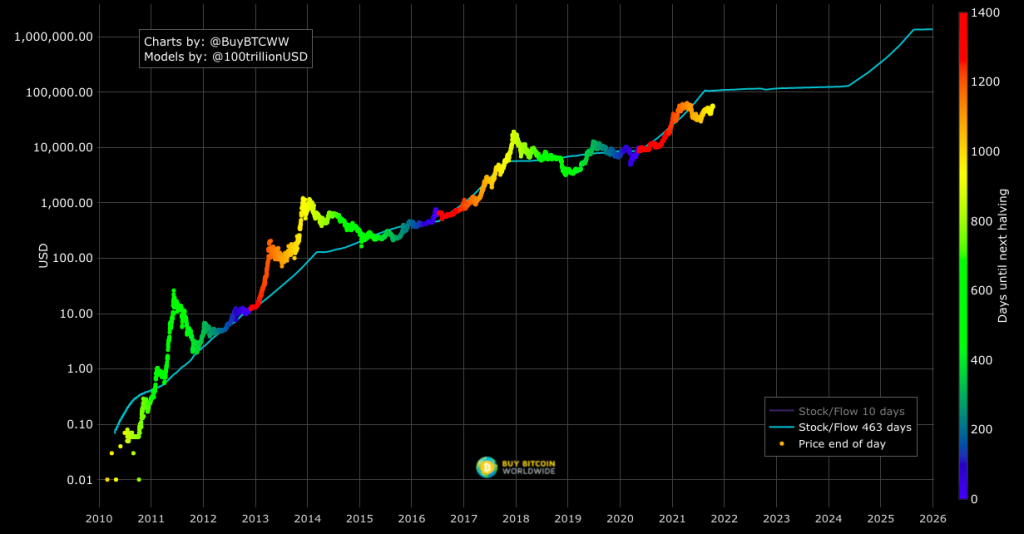
https://stats.buybitcoinworldwide.com/stock-to-flow/
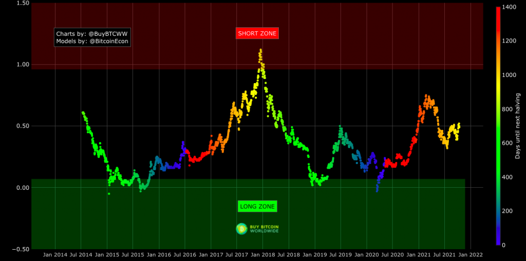
The 2-Year MA Multiplier is intended to be used as a long term investment tool. I personally like the chart. “It highlights periods where buying or selling Bitcoin during those times would have produced outsized returns.[…] As Bitcoin is adopted, it moves through market cycles. These are created by periods where market participants are over-excited causing the price to over-extend, and periods where they are overly pessimistic where the price over-contracts. Identifying and understanding these periods can be beneficial to the long term investor. This tool is a simple and effective way to highlight those periods.”
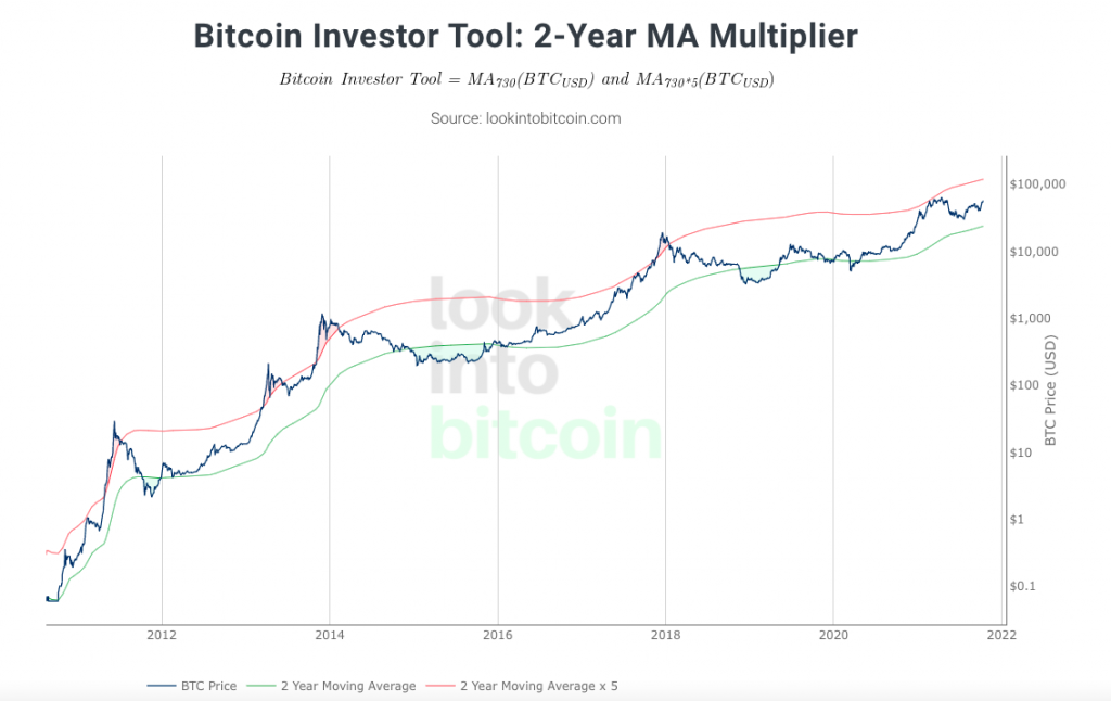
https://www.lookintobitcoin.com/charts/bitcoin-investor-tool/
Bitcoin’s natural long-term power-law corridor of growth suggest that “bitcoin’s price evolution can be understood as moving within a corridor which is defined by two power-laws based on time” [..] one corresponding to the “normal” mode and one corresponding to the “bull” mode. The price has so far spent half the time in the lower “normal mode” band, and the rest of the time in the higher “bull mode” band.”
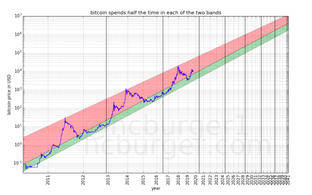
https://medium.com/quantodian-publications/bitcoins-natural-long-term-power-law-corridor-of-growth-649d0e9b3c94
This implies that large bubbles and busts are likely to continue to exist. […] This price model should also help determine good points to enter or leave the market: “The price will reach $100 000 per bitcoin no earlier than 2021 and no later than 2028. After 2028, the price will never drop below $100 000.- the price will reach $1 000 000 per bitcoin no earlier than 2028 and no later than 2037. After 2037, the price will never drop below $1 000 000.”
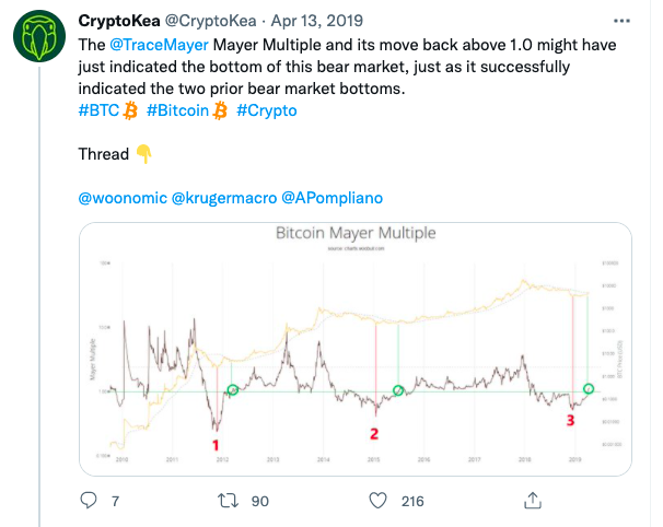
Chris Burger’s The Mayer Multiple (MM) is a ratio that takes the Bitcoin price and divides it by the 200 day moving average, giving price ranges for bitcoin buying signals.
https://twitter.com/CryptoKea/status/1116985109763117056
THE BEAM INDICATOR (Live Version) stands for “Bitcoin Economics Adaptive Multiple” and is the result of experimenting with various indicator types and formulas for almost 2 years. BEAM may look like a typical indicator, but can also be used as a basis for an anti-cyclical investment plan for Bitcoin as well as other crypto assets whose cycle is tied to that of Bitcoin. Roughly speaking, BEAM divides the price of bitcoin at any given moment to a moving average of past prices. This makes price trends more clearly visible.”
1/ The Mayer Multiple (MM) is a simple ratio that takes the Bitcoin price and divides it by the 200 day moving average price. Therefore, it is expected that a low MM coincides with bottoms (see red markings), however,
— CryptoKea (@CryptoKea) April 13, 2019
“At Tradingview.com you can apply “BEAM” and “BEAM Bands” to charts by clicking the Indicators button and searching for them. To apply them to Bitcoin I recommend that you enter “BNC:BLX” for displaying the “BreaveNewCoin Liquid Index for Bitcoin” chart and set the time frame to 1 day. Bitcoin Investor Tool: 2-Year MA Multiplier.”
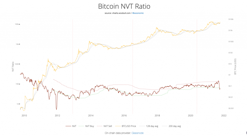
The NVT Ratio (Network Value to Transactions Ratio), set up by by everyones favourite on-chain analyst Willy Woo, is similar to the PE Ratio used in equity markets. When Bitcoin`s NVT is high, it indicates that its network valuation is outstripping the value being transmitted on its payment network, this can happen when the network is in high growth and investors are valuing it as a high return investment, or alternatively when the price is in an unsustainable bubble.

https://charts.woobull.com/bitcoin-nvt-ratio/
The Bitcoin Difficulty Ribbon, also set up by Willy Woo, provides useful metric to predict bitcoin’s price. The Diffiulty Ribbon speaks to the impact of miner selling pressure on Bitcoin`s price action. When network difficulty reduces its rate of climb, miners are going out of business, leaving only the strong miners who proportionally need to sell less of their coins to remain operational, this leads to less sell pressure and more room for bullish price action. The best times to buy Bitcoin are zones where the ribbon compresses. The ribbon consists of simple moving averages of Bitcoin network difficulty so the rate of change of difficulty can be easily seen.
https://charts.woobull.com/bitcoin-difficulty-ribbon/
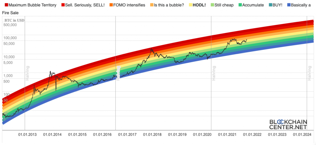
Last but not least the “Bitcoin Rainbow Chart 🌈 “is meant to be a fun way of looking at long term price movements, disregarding the daily volatility “noise”. The color bands follow a logarithmic regression (introduced by Bitcointalk User trolololo in 2014), but are otherwise completely arbitrary and without any scientific basis.” Find the Bitcoin Rainbow Price Chart (Log Scale) below.
https://charts.woobull.com/bitcoin-difficulty-ribbon/
Other indicators that were effective in the past were Google searches for “Bitcoin” and Tweets with the term “#Bitcoin”. They mirror the general enthusiasm for Bitcoin and thus its price trajectory.
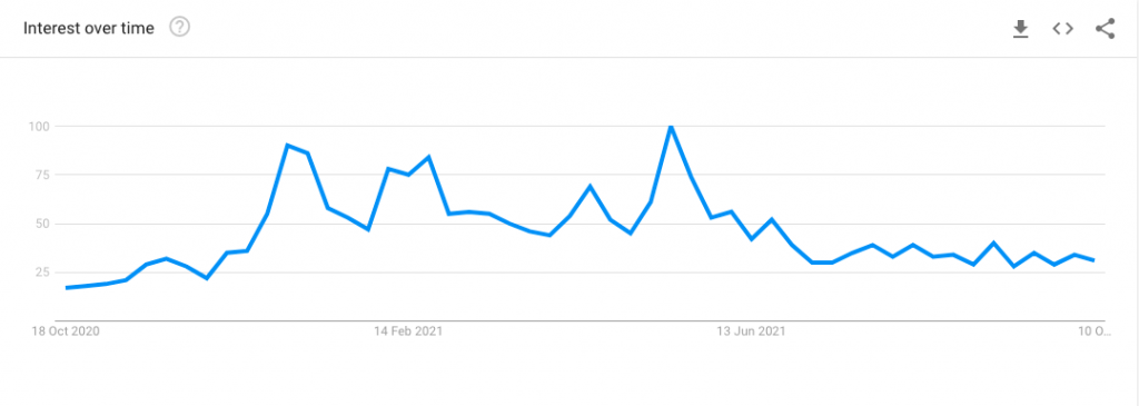
https://trends.google.com/trends/explore?q=bitcoin
Thank you for taking the time to read though this piece, if you have any questions, thoughts or advice, please reach out.
_______
Follow me
Twitter
Instagram